Friday 29 February 2008

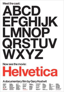
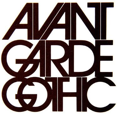
Another typeface i am very fond of...

Photobucket
Helvetica has to be one of the greatest
fonts i have ever used. Its sleek design
offers open oppertunities to develope
and manipulate in type design.

Photobucket
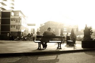
elective complete now really happy with the finals
look really nice. did them using black and white
changing levels to eye then applying a brown tint
like sepia.

Monday 25 February 2008

Micheal Thompson

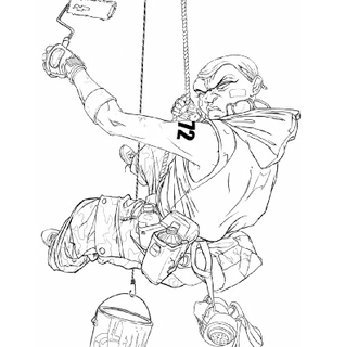
looking at drawing with line i have found this illustrator.
his techniques dont just focus on minimalistic values but
outlines tone with close lines and drawing shadows through
line.

Photobucket
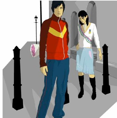
Stuart Holmes

Vector Graphics.

Photobucket

Photobucket

Photobucket

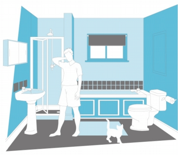
like the line detail in the drawings
Lenart andresen

Photobucket

illustration with line study handy for visual
language brief.
Photobucket

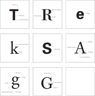
http://www.typographicdesign4e.com/

Looking at typographic conventions and
terminology around designing type.

Wednesday 20 February 2008

i would like to discover more about typeography and illustration as i have a very fond interest in the field of design. Artists like David Carson and jasper goodall are great inspirations in my work as their way of depict moods and energies in their work is fascinating.
Photobucket

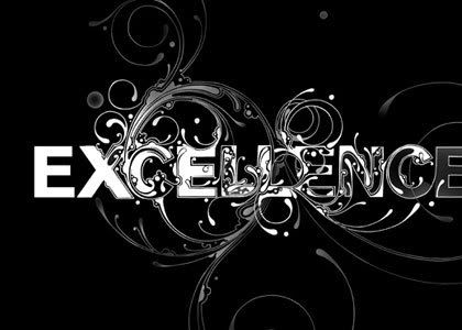
Type Design by Si Scott. As a fan of typography i am
anterested in how type can be manipulated into graphics
as apposed to just letters.

Monday 18 February 2008

PHOTOGRAPHY

Photobucket
new brief set today. sounds good. i think the set-up of the
mini briefs will make me more productive to create a more
interesting approach to the project. the three parts will also
split up the whole brief allowing us to come away and
refresh our ideas.

Wednesday 13 February 2008

my elective course is pretty cool. i have to be honest i thought it
was quite boring at first but now i have obtained so many more
skills whilst using slr digital cameras.

GOING GOOD !

Tuesday 5 February 2008

really pleased with my final outcome. i have turned my timelines
into a product which has turned out pretty cool. i wanted the
audience to interact with the product instead of it being a format
which is displayed on a wall.
really enjoying the crits they have been really
beneficial as to which direction to go in throughout
a project. last crit was excellent as i knew exactly
what to do, the crit took an afternoon however
came in really handy.

Friday 1 February 2008

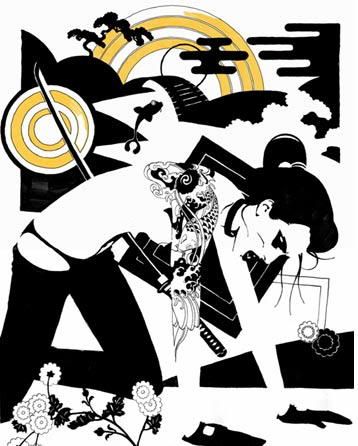
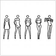
I ABSOLUTELY LOVE THESE ARTISTS!

samuri
julian opie

progress review

hey there! just looking back on where i started and how different things have changed. i believe i am progressing and thinking more for myself and starting to become more independant. at the start of this recent brief i wasnt sure how things started with ideas and concepts, food was a soar subject as it doesnt really interest me greatly however throughout the project i have started to really think of what can be made interesting out of something i think is limited. i have found with a little thought and research something so little can become something so fascinating and exciting. the current project is going well as i have found something i can get stuck in to and enjoy. as i have grown more fond of the subject i dont want to stop, i have thought of so many possibilities and products which can come out of it. in long terms this is a personal reminder of how i should work in the future, to research and get more within a subject rather than a personal view on things.

take even the worlds boring things...think and review them and then make it your own interesting and visual artwork which communicates fascination
Photobucket