Wednesday, 10 December 2008
After effects Intoduction
I experimented with after effects and created
this ad for our business proposal for enterprise.
Thursday, 4 December 2008
Experimental after effect
Playing with the effects on
the program to start me up because i am
unfamiliar with what the program can do.
i made this type experiment to show
the begginer things we can do.
the program to start me up because i am
unfamiliar with what the program can do.
i made this type experiment to show
the begginer things we can do.
After Effects Intoduction
First lesson into after effects
similar to director however alot
more can be achieve from this program.
similar to director however alot
more can be achieve from this program.
Tuesday, 25 November 2008
Evaluation "Good Brief"


At the very start of the project my initial idea would be the focus on chocolate and how it is good. I soon forgot about this idea because after a talk with the tutors i decided it wouldnt be as much as a challenge for the time available. I started to look more into environmental issues and decided of the idea that putting something back into the world would be a great idea.
The focus was achieving a package which was low on energy use, paper use and environmentally friendly. I started by looking at how i could achieve this for businesses, something which could be posted and also cheap. The idea was to design my very own organisation that specialised in getting companies to do their bit for the world.
I looked at different styles of packaging and how information could be applied to it in a readable but recycled manner. I collected existing boxes and began to draw my ideas up opening the nets so i had an idea of how each box would work. From experiments which included attempting to get the packages in the post box, settled my idea from what wouldnt fit, which became a slim box that could hold information and was fairly hard wearing to be processes through the post.
This project was not one of my strongest points of work, i feel this because i was in a spot of complication managing home issues and work at the same time. This was something of which couldnt be helped however it didnt make me feel motivated, i found i had too many things on my mind. I feel given another chance i would be able to deliver alot more in depth research analysing and design which would of aided my decision making and final package. If i was to change parts of the project it would certainly be of my time management skills and how i plan what time i have and what jobs i can achieve. As this was one of my problems it cost me from screen printing because i was unprepared for the exercise.
The project helped me to understand more about the printing processes and as a result of this has broadened my knowlege of the subject. I found that doing this project will broaden any ideas i have in projects to come because now i understand different print method i can now work with alot more materials and effects to bring my idea generation alot more forward.
Vinyl Print
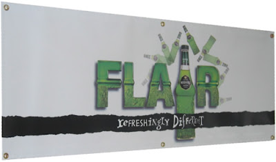
The most commonly used material is a heavy weight vinyl technically known as PVC. The weights of the different banner substrates range from as light as 9 ounces to as heavy as 22 ounces per square yard, and may be double- or single-sided. Grommets can also be added in order to facilitate hanging of the banner. Large banners (which can be so large that they cover the side of a building) are printed on a special mesh material so that the wind can pass through them.
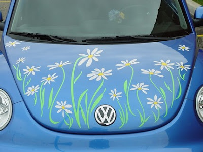


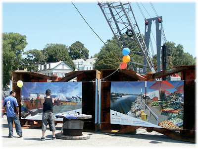
Vinyl stickers are usually transparent used for shop windows, cars, glasses, computer screens and phones.
The print process...
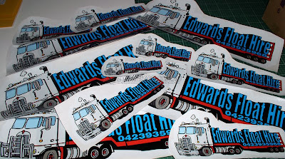
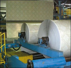
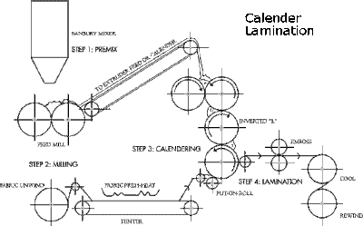


Vinyl stickers are usually transparent used for shop windows, cars, glasses, computer screens and phones.
The print process...


MONOTONE
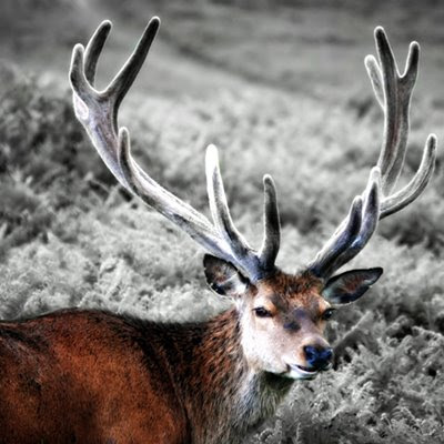
Grayscale
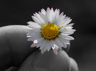
Spot colour
Duotone
CMYK
Print Processes
Thursday, 16 October 2008
Tuesday, 14 October 2008
dont panic
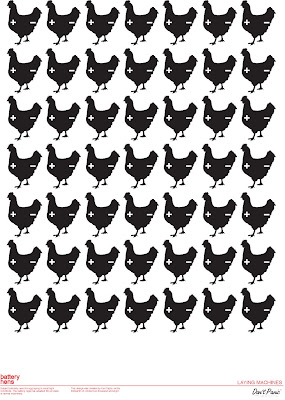
this was a competition piece for dont panic media.
the brief title was "machine". i wanted to come away
from the primary vision of machine which is often
looked at as a robot. i decided to focus on the way
things work like machines. i looked at how chickens
are subject to day in day out in battery farms used
for mass production of chicken eggs for low prices.
these animals dont stop producing and are subject to
a lifestyle of a machine.
Wednesday, 1 October 2008
NON FORMAT
>>CMYK PROCESS
Friday, 6 June 2008
Subscribe to:
Comments (Atom)


