I feel that the ppd module has become of a great advantage the help with our portfolios and placements has been great support. the portfolio groups have been at an advantage as now i have the ability to create a proffessional looking portfolio. i have been able to work out compositions and layout where the text goes and subtleties.
i feel like i am now confident in doing crits and presentations infront of a group without getting nervous and loosing track of what i am trying to say. The personal reflection presentation is a great oppertunity to not only explain what i have learnt to the audience but also reflect on myself and talk fluently what i have gained through year two.
i have found i am focussed on package design and rebranding therefore this is the main focus for year three. this will enable me to create a proffessional portfolio with the correct elements and information. For my dissertation i am going to look at packaging and how it effects its buyers through the designs, this will also be a good choice because it is at my best interest and i will then have more knowledge on products and packaging.
Thursday, 11 June 2009
Friday, 29 May 2009
EVALUATION - THREE BRIEFS
the briefs i worked on were the faber and faber book project, 78rpm mp3 song lyric and the type factory brief. the briefs were a challenge because never have we had to manage three in such a smaller time limit. usually we have had five weeks to occupy one brief.
the aim of this was to settle a detailed timetable to organise the projects so i had enough time to spend on each brief. i had started to plan a timetable then i had different problems which i couldnt help that made this quite a challenge. i found that certain projects had to be squeezed into my time that i had left. the type factory brief was the longest and i had much more work to show for it. the song lyric i had developed a decent amount of work and a fairly decent outcome. the book project i decided to work on a two day brief with the adequate research i needed and the design work was done digitally then the photography as taken to produce my boards.
the briefs were developed in a shorter timescale than i had wished however i was happy with the designs and the developement work was also fairly consistent. i believe that the work i have is at a fair standard however i can easily produce a lot more work in the time given however it was caused from my absence.
overall i believe the work submitted was adequate for marking however i know there is always room for improvement. if i was to rework on the briefs i would certainly change my timetable skills and share the workload evenly through the set of briefs.
Monday, 19 January 2009
Wednesday, 10 December 2008
After effects Intoduction
I experimented with after effects and created
this ad for our business proposal for enterprise.
Thursday, 4 December 2008
Experimental after effect
Playing with the effects on
the program to start me up because i am
unfamiliar with what the program can do.
i made this type experiment to show
the begginer things we can do.
the program to start me up because i am
unfamiliar with what the program can do.
i made this type experiment to show
the begginer things we can do.
After Effects Intoduction
First lesson into after effects
similar to director however alot
more can be achieve from this program.
similar to director however alot
more can be achieve from this program.
Tuesday, 25 November 2008
Evaluation "Good Brief"


At the very start of the project my initial idea would be the focus on chocolate and how it is good. I soon forgot about this idea because after a talk with the tutors i decided it wouldnt be as much as a challenge for the time available. I started to look more into environmental issues and decided of the idea that putting something back into the world would be a great idea.
The focus was achieving a package which was low on energy use, paper use and environmentally friendly. I started by looking at how i could achieve this for businesses, something which could be posted and also cheap. The idea was to design my very own organisation that specialised in getting companies to do their bit for the world.
I looked at different styles of packaging and how information could be applied to it in a readable but recycled manner. I collected existing boxes and began to draw my ideas up opening the nets so i had an idea of how each box would work. From experiments which included attempting to get the packages in the post box, settled my idea from what wouldnt fit, which became a slim box that could hold information and was fairly hard wearing to be processes through the post.
This project was not one of my strongest points of work, i feel this because i was in a spot of complication managing home issues and work at the same time. This was something of which couldnt be helped however it didnt make me feel motivated, i found i had too many things on my mind. I feel given another chance i would be able to deliver alot more in depth research analysing and design which would of aided my decision making and final package. If i was to change parts of the project it would certainly be of my time management skills and how i plan what time i have and what jobs i can achieve. As this was one of my problems it cost me from screen printing because i was unprepared for the exercise.
The project helped me to understand more about the printing processes and as a result of this has broadened my knowlege of the subject. I found that doing this project will broaden any ideas i have in projects to come because now i understand different print method i can now work with alot more materials and effects to bring my idea generation alot more forward.
Vinyl Print
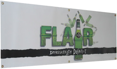
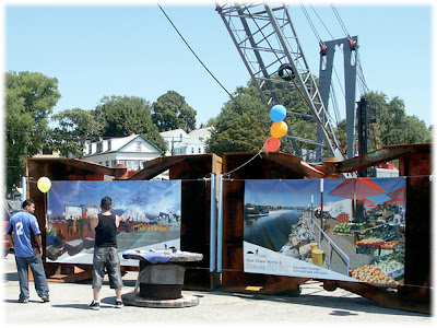
The most commonly used material is a heavy weight vinyl technically known as PVC. The weights of the different banner substrates range from as light as 9 ounces to as heavy as 22 ounces per square yard, and may be double- or single-sided. Grommets can also be added in order to facilitate hanging of the banner. Large banners (which can be so large that they cover the side of a building) are printed on a special mesh material so that the wind can pass through them.
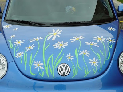


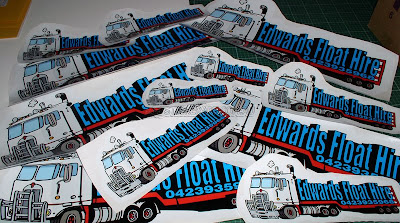
Vinyl stickers are usually transparent used for shop windows, cars, glasses, computer screens and phones.
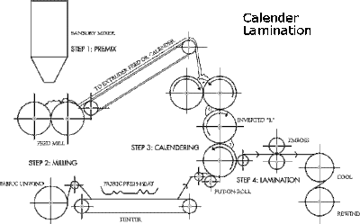
The print process...
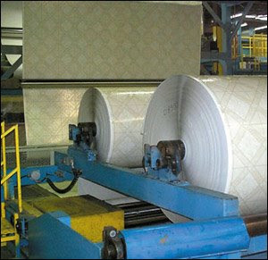


Vinyl stickers are usually transparent used for shop windows, cars, glasses, computer screens and phones.
The print process...


MONOTONE
Grayscale
Spot colour
Duotone
CMYK
Print Processes
Thursday, 16 October 2008
Subscribe to:
Posts (Atom)


